Thursday, April 30, 2015

HomeBuyers Paper Work Checklist

Screen Shot 2015-03-17 at 5.26.32 PM
Looking to buy or sell?  Let me know how I can help.
 

Contact your local RE/MAX  Realty Center Agent Stacey Guzanick 262.490.3696, Guzanick@gmail.com,  if you have questions about buying a house or selling one. I can  guide you  toward your next home.

www.HomesWithStacey.com

See you at the closing!
Wednesday, April 29, 2015

You Might Laugh at its Size, But Just Wait…

You Might Laugh at its Size, But When You See the Interior…

zzz
This 280 square foot house is located in Portland Oregon, but the inspiration to build it originated in Japan — a culture of people well-known for maximizing small spaces in a beautiful and simplistic way.
The creator of this home, Chris Heininge, became a Christian Missionary at the age of 17, and he spent the next 20 years in Japan, Hong Kong, Macau, and India. While in Japan, Chris was able to build one house and remodel others. He was influenced by the concept of “tiny living”.
When Chris and his family returned to Aurora, Oregon in 1995, he became a General Contractor and built and remodeled many homes with his parents and brothers. With the encouragement of his childhood friend, Maurice, he was able to build his first Tiny House on river frontage in 1999, and the 2nd one in 2006.

Here is one of the homes from the outside.

1-tiny-house
via Chris Heininge | Tiny House

And the living room from the kitchen.

2-tiny-house
via Chris Heininge | Tiny House

Underneath the stairs to the loft space, there’s a cozy fireplace.

3-tiny-house
via Chris Heininge | Tiny House

All the appliances are included in the price of the home.

4-tiny-house
5-tiny-house
via Chris Heininge | Tiny House

The ceiling in this lofted bedroom is 7 ft. at its highest point.

6-tiny-house
via Chris Heininge | Tiny House

The bathroom even has a full-size jacuzzi tub.

7-tiny-house
via Chris Heininge | Tiny House

The cabinets can be replaced with a washer and dryer.

8-tiny-house
via Chris Heininge | Tiny House

The total cost for one of these homes? $70,000.

9-tiny-house
10-tiny-house
Source: Tiny House

Specifications

Price: $70,000
Dimensions: The Tiny House is just under 10 X 20 feet and 15 feet high.
Exterior walls: 2″x4″ Framed Select Doug Fir with 3/4″ AC Exterior Plywood.
Exterior roof material: This is a standard high-quality, standing-seam, snap-down metal roof. There are no cut-through vents or pipe vents in the roof panels.
Insulation: R-MAX Foam batts in walls, floor, and ceiling. R-values are: roof 17.5, floor 10, walls 7.5
Exterior Finish: Eastern White Cedar shingles, Senergy® stucco, cedar trims.
Floor material: 2″ x 6″ aluminum tubing for perimeter frame and most floor joists. Sub-floor: 1/2″ ACX plywood with quality vinyl, carpet in loft.
Electrical Extra: Bathroom is pre-wired (and pre-plumbed) for a stacked 24″ washer/dryer. Also pre-wired for a 220V burn toilet (optional).
Dual Heating: Besides the 1500 W simulated fireplace, there is a 1500 W
under-cabinet “Toe Kick” blow heater.
Water Heater: Hidden under the stairs, with outdoor access is a 40 gal. GE water heater sufficient for supplying the American Standard® whirlpool tub, which is your standard full-sized tub at 60″ by 32″.
Interior Finish: Walls and ceilings a combination of CVG (Clear Vertical Grain)
Fir, CVG laminated sheet goods, and Senergy® stucco.
Cabinets & doors: All custom-made from top-quality plywood and Hardware, and a few sliding doors made of bronze-tinted plexiglass.
Looking to buy or sell?  Let me know how I can help.
 

Contact your local RE/MAX  Realty Center Agent Stacey Guzanick 262.490.3696, Guzanick@gmail.com,  if you have questions about buying a house or selling one. I can  guide you  toward your next home.

www.HomesWithStacey.com

See you at the closing!
By Mike Bell 

Tuesday, April 28, 2015

Tips for Making Any Room Seem Larger

4 Tips for Making Any Room Seem Larger


Plenty of people live in tiny homes, small rooms, or just diminutive spaces. No matter what your reason for living in smaller quarters, you’ll undoubtedly have to make some compromises in your decorating.
To live happily and efficiently in smaller square footage, you’ll want to get organized and make some adjustments to your lifestyle. By making the most of color, strategic furniture buying, space planning and interesting lighting, your place can feel wonderfully “you” — with all the space you need.

Expand your square footage to the outdoors

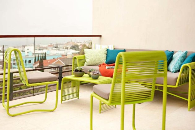
If you have large windows with beautiful views, add those colors to your room to unify the outside world with inside space and expand the look of your rooms. With the wonderful patterns and colors that outdoor fabrics offer, there is no reason to stop the “pretty party” at your interior.
Patio
Source: Chris Barrett
Carrying coordinating materials outside for drapes, cushions and area rugs will only make your space look visually larger. On the interior, let as much natural light into a room as possible so it opens up the space and gives it character.
Declutter your space. Try to dispose of everything you have not used for a year. Do not get attached to furniture. Get rid of any item that is not adding to the look of the room.
Create organized storage wherever possible via built-in benches and use multi-purpose and storage furniture pieces, such as ottomans, so items that are less frequently used can be stowed away.
When it comes to cabinets and bookcases, do not fill up every shelf in a room; leave some of them half empty and spacious for an airy and more dramatic look.
Where functional, remove as many doors as possible or use pocket doors to increase the sense of space.

Keep it simple

Link adjacent spaces with a unifying wall color and floor material. Maintaining a monochromatic palette makes rooms look bigger. If you do need to change flooring materials, simply stay within the same color family — the fewer floor “breaks,” the better.
Light colors or neutrals are space expanders and provide a neutral background for furniture and artwork.
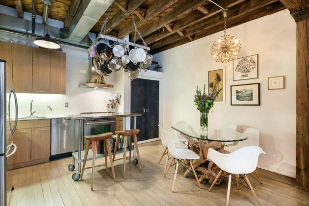
simple kitchen
Source: Zillow Digs
Using cool colors will make your walls appear to visually recede. Additionally, it is best to avoid unnecessary details, such as ruffles, in furniture and window treatments. Use simple paneled draperies or shades instead.

Make a statement

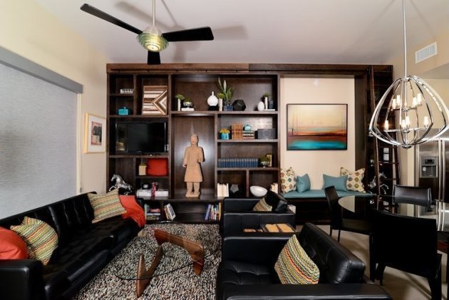
Installing an oversized mirror or a set of smaller mirrors will add extra light, sparkle and make a small room appear larger. Even if a room is small, adding oversized artwork on a small wall or a statement light fixture overhead can create drama while making the space appear larger than it is.
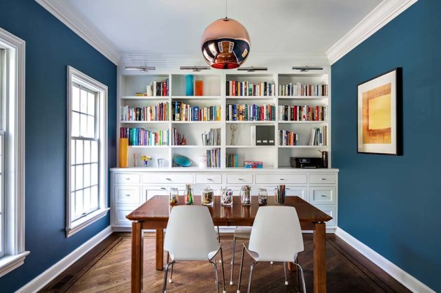
bookcase
Source: Claire Paquin
You may also consider adding a floor-to-ceiling and wall-to-wall bookcase — this trick will create an impressive focal point and visually expand space by pushing the walls and ceiling out.
Looking to buy or sell?  Let me know how I can help.
 

Contact your local RE/MAX  Realty Center Agent Stacey Guzanick 262.490.3696, Guzanick@gmail.com,  if you have questions about buying a house or selling one. I can  guide you  toward your next home.

www.HomesWithStacey.com

See you at the closing!
Monday, April 27, 2015

8 Small Bathroom Designs You Should Copy

8 Small Bathroom Designs You Should Copy


8 Small Bathroom Designs You Should Copy
A master bathroom with a whirlpool tub, a rainfall shower head, heated floors and his and her sinks is great for some, but oftentimes, space and budget concerns bring most of us back down to earth.
Don’t let your small bathroom limit your dreams or creativity. There have been plenty of homeowners and designers who have done amazing transformations with spaces most Americans would consider a small bathroom.
We have rounded up our favorite small bathroom designs, as well as the strategy and subtle cues that make you forget how small your bathroom really is.
Small Bathroom: Dark Paint
When dealing with a small bathroom, it’s usually a smart call to go with brighter or softer colors, as my coworker Alyson Yu pointed out in 6 Design Ideas To Make The Most of Your Small Bathroom. Nonetheless, these homeowners went with a dark brown to match the color of the bedroom. For the bathroom, they added leaf pulls to the mirror, an oil-rubbed bronze faucet, granite counters and small oil paintings.
Despite its darker color, we like the color choice thanks to the sense of continuity with the rest of the bedroom.
Small Bathroom: Pedestal Sink

Most small bathrooms are used as guest bathrooms in the hallway. Well, just because it’s not your primary bathroom, that doesn’t mean you can’t design it with the best.
This vintage small bathroom utilized bead board paneling, a light taupe color and something all small bathrooms need; a pedestal sink.
Pedestal sinks were designed and made for small bathrooms. Unlike a bathroom vanity, it doesn’t take up valuable space at your feet or in one end of the bathroom. You may lose some cabinet space, but you gain valuable square footage, both in looks and feel.
Small Bathroom: Bold Colors
Who said small bathrooms had to be boring and dull? These homeowners were certainly not afraid to go bold and bright with an entire wall mural dedicated to life under the sea.
Continuing the theme, they added green countertops, green and blue hand towels and other sea-themed furniture items throughout.
Given its size, we love the addition of the dark wood cabinets on the counter. You certainly sacrifice counter space, but oftentimes, homeowners need those cabinets for extra towels, toiletries and other bathroom supplies. 
Small Bathroom: Gold Tile
If you are short on space and want to make a splash in your small bathroom, you better upgrade the color and vanity. These homeowners show that bold colors and ceramic tile can go long way in adding that “wow” factor to any small bathroom.
In this custom bathroom remodel, they incorporated ceramic, gold tile along the wall, marble counters, gold and red accents throughout and an Asian theme. They certainly spent their fair share on this bathroom remodel, but according to our bathroom renovations cost estimator, the average cost to remodel a bathroom is $7,920.
Small Bathroom: Arched Ceilings
Arched ceilings are a great way to add the idea of extra square footage to any small bathroom. These homeowners also incorporated a recessed shower shelf, which is a must-have for all small bathrooms. It doesn’t only make your key toiletries accessible, but it also doesn’t get in your way.
Other additions that you wouldn’t normally see in the casual small bathroom include granite counters, pink flowers, a casement window and a purple shower curtain. It’s small bathroom style at its finest.
Small Bathroom: Modern
Small bathrooms do not get much more modern than this with the white tile floors and walls, a wood rug, black accents, a dark wood vanity with plenty of storage, recessed lighting and a vessel sink.
At first glance, the bathroom may seem large, but the sleek features, black and white hues, as well as the perfectly placed vanity make it look and feel larger than it really is.
They were also able to add a tub and shower combo. 
Small Bathroom: Bathtub
Just because you have a small bathroom doesn’t mean you can’t spend a whole night in your bathtub reading a good book. This Victorian masterpiece utilized a brushed nickel faucet, translucent glass in the window, a bathtub tray to hold the necessities and white tile all around.
With a bathroom like this, you forget all the worries that come from a long day at the office.
Small Bathroom: Vanity
This may be one of the best small bathroom designs we have ever seen. Let’s first start off with the huge mirror above the vanity. Did you know that mirrors work with the light to create a wider look for any bathroom? Therefore, you should always go as big as possible when it comes to mirrors in a small bathroom.
Now, let’s move to this open vanity. They have three large shelves/holders for larger bathroom items like towels and four small placeholders for other necessary items like soap or shampoo. You may have to keep it clean, but when you do, your small bathroom can look as radiant and cheerful as this gem.
Small bathrooms should never limit you as a homeowner. Despite limited square footage, you can create a luxurious bathroom that other small bathroom owners only dream about. Make those dreams a reality.
 
Looking to buy or sell?  Let me know how I can help.
 

Contact your local RE/MAX  Realty Center Agent Stacey Guzanick 262.490.3696, Guzanick@gmail.com,  if you have questions about buying a house or selling one. I can  guide you  toward your next home.

www.HomesWithStacey.com

See you at the closing!
Sunday, April 26, 2015

Make Your Home Shine for Resale

Clean, Declutter, Discard: Make a House Shine for Resale

zzzPurging belongings can be an arduous task for sellers. Share these 13 decluttering tips with your clients to help them prepare their home for sale.

Sentimentality can be a powerful disincentive to declutter. How could a loving daughter sell her family silver, even though she dislikes the pattern? How could parents ever discard a painting by their young budding Picasso, even though he’s now 30 and hasn’t picked up a paint brush in 20 years?
Most home owners avoid those tough decisions and schlep possessions from house-to-house. But it’s far smarter to shed before moving. Not only does it clear out space to make a listing look its best, it also saves on moving costs to transport less stuff.
Are your sellers clinging to keepsakes? Share with clients these 13 steps to help make the task of decluttering less daunting.
Tip: Taking photos may help your clients look objectively at their house, suggests Amy Trager, certified professional organizer and president of the Chicago chapter of the National Association of Professional Organizers.
1. Study the entire house. Sellers shouldn’t tackle every room in one fell swoop. Advise them to go room-by-room, starting at the front door. Sellers should pretend they’re seeing each room for the first time, says Kammie Lisenby, CEO of The Organizing Experts in Seattle. The goal is to make rooms resemble those in a hotel, says professional organizer Katrina Teeple, owner ofOperation Organization in Los Angeles.
2. Make piles. Sellers should organize piles as they clear each room — for example, stack items to keep, give to family or friends, donate to a charity, sell online, get hauled away, and consign. They should bear in mind the size of the home they’re moving to, their degree of sentimental attachment, and the financial value of each item. It’s best to put highly personal items aside in the keep pile, such as family photos they don’t want buyers to see during showings, says Lisenby.
Tip: Sellers could offer a buyers’ allowance to do their own decorating, says Barry Izsak, owner of Arranging It Allin Austin, Texas, and former NAPO president.
3. Create a spreadsheet. A master list of what rooms will require organizing tasks can be helpful. This will also aid in prioritizing expenses, such as home improvements, paint, and staging elements. To play it safe with finicky buyers, sellers should go neutral in paint and decor, says Teeple.
4. Empty closets. Often becoming a graveyard for all the belongings home owners don’t know what to do with, clean, spacious closets are a coveted feature among buyers. Izsak suggests eliminating anything not worn or used in the last two years. Aim to dispose of 50 percent of wardrobes since most people only wear 20 percent of their clothes 80 percent of the time, he says. The remaining items should be stored on uniform rods, or in labeled, see-through bins, says Teeple.
5. Clear off counters and bookcases. Get rid of books that won’t be reread, particularly now that so many people read online. Add a few home decor items for sparkle. When in doubt, follow the “rule of three,” a mantra among home stagers, by clustering items into threes to create visual appeal. The final effect should reflect a neutral style.
6. Inspect the home’s exterior. Depending on the time of year, sellers may need to hire a professional to clear leaves, snow, or ice, so that they don’t hide a home’s features. Messiness and wear and tear on the outside indicates to buyers that the inside hasn’t been cared for well.
7. Check curb appeal all around. While the front yard is key to making a good first impression, more home owners spend time out back, so sellers should be sure lawns, shrubs, trees, and amenities like a fence and air conditioning condensers are maintained.
8. Spruce up the kitchen. This is the home’s most popular gathering spot and another place where everything gets dumped—backpacks, car keys, cell phones, etc. The rule of three applies here, too. Tell sellers not to stuff anything into a pantry or cabinets; get rid of it if it hasn’t been used in a few years. Also, clean out the refrigerator and freezer.
9. Make bathrooms spotless. Not every seller has a spa bathroom to unwind in, but clean grout, tiles, shower door, and vanity can make a big difference in an average bathroom. Clear out the prime real estate of a medicine cabinet, add crisp white or other neutral towels, fresh soaps, and a plant, Teeple suggests.
10. Purge basements, attics, and garages. These are a home’s purgatories—where stuff goes to never see the bright light of day, says Izsak. Anything that’s been moved at least twice and not opened needs to be reassessed, says Chris Seman, president of Caring Transitions in Cincinnati, a relocation service. Separate the items to be stored in see-through bins to reveal their contents; do so by categories, such as holiday decorations; and be sure bins are labeled clearly and have lids to keep out pests.
11. Professionalize an office. With more home owners working from home, a separate room or corner for an office can boost sales appeal. Have sellers clear up paper piles and file documents—but remember, most home owners only reference 5 percent of their files, says Seman. The work area should include good illumination, a comfortable chair, and clean equipment, says Izsak.
12. Get rid of belongings. Now it’s time for your sellers to rethink what to do with everything in piles. Here are some upsides and downsides to these decisions:
  • Sell or auction through an online vendor like Craigslist or eBay or at a flea market. Downside: It may take time to get the desired price.
  • Leave at a consignment shop to get stuff out of a house now. Downside: Proceeds get shared, and it may take a while to sell.
  • Give away to family, friends, or a nonprofit such as freecycle.org. Some communities let residents leave stuff outside their house with a sign, “Take it!” Upside: It gets rid of things fast.
  • Have a group haul it away such as 1-800-Got-Junk? Upside: This avoids driving it to a dumpster.
  • Donate to a charity. Upside: It gets out of a house, helps someone in need, and provides a deduction. Fill out IRS Form 8283 if total exceeds $500.
  • Organize a yard sale. If time is of the essence, the seller could hire a professional who sets up tables, takes money, and gets rid of what doesn’t sell. Downside: Proceeds get shared.
13. Don’t repeat collector mania. Once sellers move into their new home with fewer possessions, advise them to purchase carefully. Sending organization ideas and decluttering tips is a great way to keep in touch with past clients. Check out HouseLogic’s REALTOR® Content Resource for helpfulhome staging, maintenance, and organizing articles you can use in your newsletter or blog, or share them on your social networks for free.
Looking to buy or sell?  Let me know how I can help.

Contact your local RE/MAX  Realty Center Agent Stacey Guzanick 262.490.3696, Guzanick@gmail.com,  if you have questions about buying a house or selling one. I can  guide you  toward your next home.

www.HomesWithStacey.com

See you at the closing!

Friday, April 24, 2015

5 Inexpensive Steps to a Speedy Home Sale

5 Inexpensive Steps to a Speedy Home Sale


galleryhip.com
galleryhip.com
If you’re a homeowner considering a move or a real estate agent listing a home, you may be wondering what the home needs. Do I need to renovate the kitchen? Repaint the exterior? Replace the flooring? Before taking on a costly remodel, consider this: these measures don’t always recoup the highest percentages in return. Many sellers have much more success by investing in upgrades that boost their home’s value in the process. The best part? Both sides of the transaction profit.
Consumer Reports recommends completing these updates:

1. Paint key rooms.

wisegeek.com
wisegeek.com
In the grand scheme of things, painting is one of the least expensive ways to freshen up your home for sale, but it can cost up to $300 a room if you’re hiring a pro to do your entire home. Save big by painting just a few select areas: high-traffic rooms, like the kitchen and bathrooms, and rooms with brightly-painted walls. You can save even more by doing the project yourself – a gallon of paint averages about $30.

2. Spruce up the exterior.

home.howstuffworks.com
Your home’s exterior is the first impression for many buyers online and in person. Aside from keeping up with maintenance like mowing the lawn and trimming shrubs, assess the outside of your home for any repair work – a fading front door, cracked siding or a loose step – that needs to be completed before selling. And don’t forget about the roof. If it needs to be replaced, choose an inexpensive but durable option, like standard, three-tab asphalt shingles. They cost approximately $75 per 100 square feet, including installation.

3. Upgrade the bathroom.

agwilliamspainting.com
Bathrooms can become a point of contention for buyers if they’re not in tip-top shape. Rather than taking on an expensive renovation, make minor upgrades that have an impact. Caulk the tub, re-grout tile, and install new fixtures. Larger, less costly fixes are also a possibility if you know where to look – a new vanity, for instance, can cost less than $1,000 if you shop around.

4. Make kitchen repairs.

foxmls.com
foxmls.com
Buyers want to be wowed by the kitchen, but that doesn’t mean you have to fork over tens of thousands of dollars to make that happen. Focus on making repairs that cost well under $500, like tightening a leaky faucet or eliminating burn marks on countertops. For a cheap alternative to repainting your cabinets, consider updating your hardware in a modern finish.

5. Clean, clean, clean.

cleaningservicechinohills.com
Even if the home has been renovated top to bottom, a messy appearance can be the ultimate deal breaker. Fortunately for sellers, de-cluttering and de-personalizing doesn’t have to cost a dime. A short list that will help buyers visualize living in the home:
- Vacuum, dust and wipe all surfaces regularly while your home is on the market.
– Pare down closets to the bare essentials.
– Replace family or otherwise personal photos with neutral wall art.
– Cut clutter in cabinets and on bookshelves.
– Keep counter and tabletops clear, especially during an open house.
If the project is overwhelming, consider hiring a professional cleaning service or organizer to cut through the chaos. A pro can cost anywhere from $600 to $2,500.
Looking to buy or sell?  Let me know how I can help.
 

Contact your local RE/MAX  Realty Center Agent Stacey Guzanick 262.490.3696, Guzanick@gmail.com,  if you have questions about buying a house or selling one. I can  guide you  toward your next home.

www.HomesWithStacey.com

See you at the closing!

Thursday, April 23, 2015

Tips for Giving Your Patio A Make Over

2-Spring_Patio_Makeover

1. Work with what you have. Don’t try to renovate your entire yard, turning one project into five projects. Get out a pencil and paper and begin drawing your ideal patio, using your current space. Take measurements and see what you have to work with and what you’ll need.
2. Consider where you live and what type of patio surface will work best.What will your surface be? Will you need to tear up an existing patio and lay new concrete or a slab? Do you want to have a natural space with no poured concrete, but decking instead? We chose a concrete slab and wanted the space to be smooth because we’d have to shovel it during the winter.
3. Plan your shade. This is an important one because without shade you won’t want to enjoy your patio during a hot summer day. Consider adding a pergola for shade and to give your patio a unique look. I’m in love with this 4th of July BBQ haven I saw on HomeTalk. True inspiration. Our budget limited us at the time so we decided to use a patio umbrella instead, which actually works great and gives our patio a pop of color from the road.
4. Consider landscaping and plants. All outdoor patios need plants and flowers, so you’ll need to budget for this. I recommend planting annuals to save you money year after year and plants that will repel those pesky bugs.
5. Seating and outdoor furniture is a must. What will your budget allow for? You can shop garage sales, thrift stores and even the newspaper ads for used patio furniture that might just need replacement cushions. I highly recommend colorful cushions (remember to have a place to store them during bad weather). Blissfully Ever After has some great ideas for giving your patio a makeover on a budget, and I like how she chooses outdoor furniture that she doesn’t have to worry about. A simple can of spray paint can give an old table a new look!
6. Start small. If you have grand ideas for your outdoor patio but your budget doesn’t match your dream, add on as the years go by. Start with what you can afford and add fresh plants and flowers to give it a nice look. The year after, choose new furniture or add an outdoor grill. Everything doesn’t have to happen at once.
7. Add décor. When you add décor to an existing or new patio, you’re giving it a breath of fresh air. An outdoor painting, a new outdoor rug, a bright and flowery outdoor pillows or even some solar lights to light the walkway can bring the space to life. I find a lot of inspiration when I’m using Pinterest. I also don’t have a large budget so I like to use things that I can upcycle, such as a wheelbarrow with flowers planted inside or an old wooden ladder to set a lantern and candles on. Décor doesn’t have to break the bank. Drive by a garage sale or antique shop, and you might find your next patio planter.
Your patio is your space to enjoy—if you like spending time there, that is what matters most. If you’re giving your patio a spring makeover to sell your home, keep it simple but appealing to the eye. And remember, you don’t have to spend a fortune. A can of spray paint with a new rug and cushions can make something old new again so don’t stress about your budget.
What tips do you have for giving a patio a spring makeover?
Looking to buy or sell?  Let me know how I can help.
 

Contact your local RE/MAX  Realty Center Agent Stacey Guzanick 262.490.3696, Guzanick@gmail.com,  if you have questions about buying a house or selling one. I can  guide you  toward your next home.

www.HomesWithStacey.com

See you at the closing!

Wednesday, April 22, 2015

FIVE TIPS FOR BEAUTIFUL GRANITE COUNTERTOPS

FIVE TIPS FOR BEAUTIFUL GRANITE COUNTERTOPS

The interior design industry has been trying for years to break homeowners' addiction to granite counters. They've introduced stainless, concrete, glass, quartz, wood, marble and other ideas to wean people away, but the alternative surfaces just don't have the luxury look that granite does.
If you're getting granite countertops for the first time, here are five things you need to know:
Choose the right stone. Granite is a general term that describes a type of granular igneous rock formed by cooled magma and indigenous minerals. Depending on where the granite is quarried, it can be stunning with streaks of gray, pink, red, green, blue or gold. The rarity of the vein of granite can drive up the price considerably, as well as the thickness and the type of fabrication you choose.
When you shop for granite, don't choose from a sample. You're basically buying the whole slab so that's how you should shop. Look only at whole slabs, as the fabricators will use as much as possible to match sections and to minimize waste. Sometimes it's possible to buy two or more slabs from the same lot. They are sliced just like pieces of toast so they can accommodate large kitchens. If they're put back to back, they form butterfly or mirror images of each other.
The beauty of granite is the movement of color and the pattern of streaks and dapples, so choose wisely. A strong graphic pattern will be highly energizing, while a softer color and pattern will be calming.
Hold the Dumb End of the Tape. Granite is sold by the square foot. You can get an idea of the number of square feet you need by multiplying length by width for each section of the kitchen, such as countertops, backsplash, and an island. Then add the square feet of each section together.
But that's not all there is to measuring. There's an edge allowance, seam allowance, sinks and other things to consider. You can tell your salesperson how many square feet you think you'll need, and he or she can direct you to slabs and lots that are large enough to fulfill your order. Once you choose, the salesperson will "hold" the slab with a deposit, until the fabricator can come out to measure exactly.
Meanwhile, your cabinets should be installed before the fabricator comes out. Most appliances fit under the countertops, but if you're installing a new sink or cooktop, the fabricator will need those measurements, too. Let the fabricator take the measurements. That way the fit is guaranteed.
Be aware of slab thickness. Not all granite slabs are sliced the same, so expect to pay more for a three-inch thickness than a one-inch thickness. If you choose a thick granite, make sure your cabinets can support that much weight.
Next, you'll choose an edge that is bullnose, ogee or beveled, or raw-edged. The finish can also change the look of the granite. Polished granite is glossy and reflective. Honed granite is a smooth matte finish. Leather is a textured finish.
Ask for as few seams as possible. If you're doing a large area like a kitchen, you want to use as few seams as possible so that the flow of the granite pattern and color is less interrupted. A seamless slab in a kitchen looks beautiful and holds more value than seamed pieces because it's like a work of art. Ask the fabricator if any parts of the job can be done without a seam. Sometimes it's very possible, depending on the design of your kitchen.
To save money, you can choose granite tiles, which is like a tile, so there will be no seams, but they add little value to your home. You can also order from scraps the dealer may have leftover from other jobs, but they're only be suitable for small jobs where you don't have to match another granite, such as a powder bath or laundry.
Granite requires care. Granite is fairly heat-resistant and easy to clean, but you should keep in mind that it's also porous. It can crack, chip, stain and show scratches.
Don't put hot pans directly on the surface; use a trivet or hot pad. Use only granite-safe cleansers. Don't use bleach, ammonia products, scouring pads, or anything acidic such as lemon or vinegar to clean. Don't use dish soap to clean as it can leave a dulling film on the surface. Spills of wine, juice and tomato sauce should be cleaned up quickly.
Some finishes such as polish act as more of a seal, but you can also purchase granite sealers at your local market. Just wipe it on once a year or so to keep your countertops looking their best.
If you're wondering whether your countertop needs sealing, spill some clean water or the surface and cover it with a paper towel. If it leaves a stain, it will go away eventually, but you'll know it's time for sealant.
Looking to buy or sell?  Let me know how I can help.

Contact your local RE/MAX  Realty Center Agent Stacey Guzanick 262.490.3696, Guzanick@gmail.com,  if you have questions about buying a house or selling one. I can  guide you  toward your next home.

www.HomesWithStacey.com

See you at the closing!
Written by